
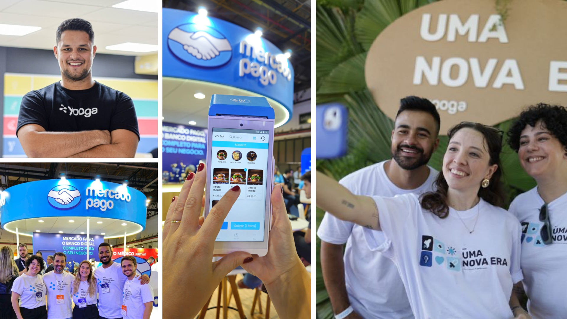
Lari Pancieri

New Onboarding - Yooga
Product Design
UX Research
UI Design
The challenge
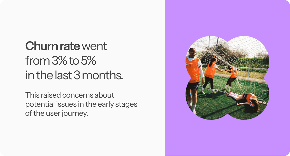
In one of our alignment meetings, the COO flagged a high churn rate: between 3% and 5% within just three months. This raised concerns about potential issues in the early stages of the user journey.
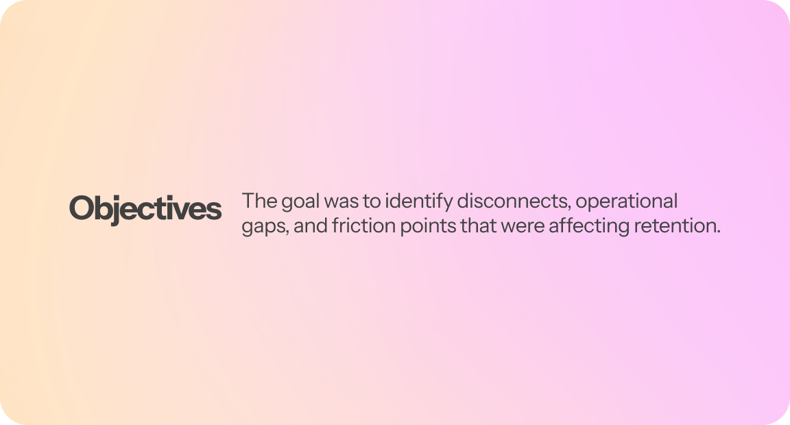
The goal was mapping the customer onboarding and activation journey to identify gaps and internal bottlenecks that could be contributing to early churn.
Hypothesis
We believed that churn was happening during the onboarding phase, due to a lack of clarity around the product's value and possible friction in the first days of use.
I proposed creating a Service Blueprint to map the user's journey alongside Yooga’s internal processes. This would help us identify disconnects, operational gaps, and friction points that were affecting retention.
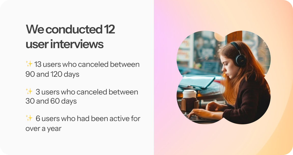
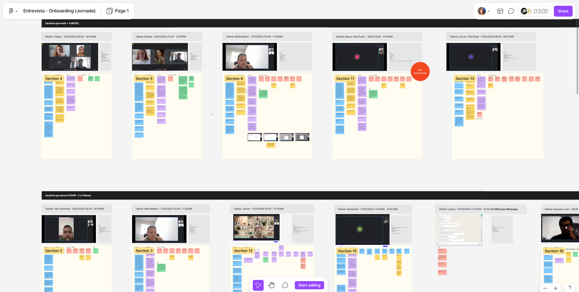
Starting the UX Research 🔍
This stage involved defining the research plan, participant profile, and interview script; recruiting users; conducting interviews; analyzing data; synthesizing it into a Persona Document; and presenting the results visually to the team.
Investigation 🔍
This is the phase of user interviews, data analysis, and persona documentation. It's a crucial step for generating meaningful research insights and results.
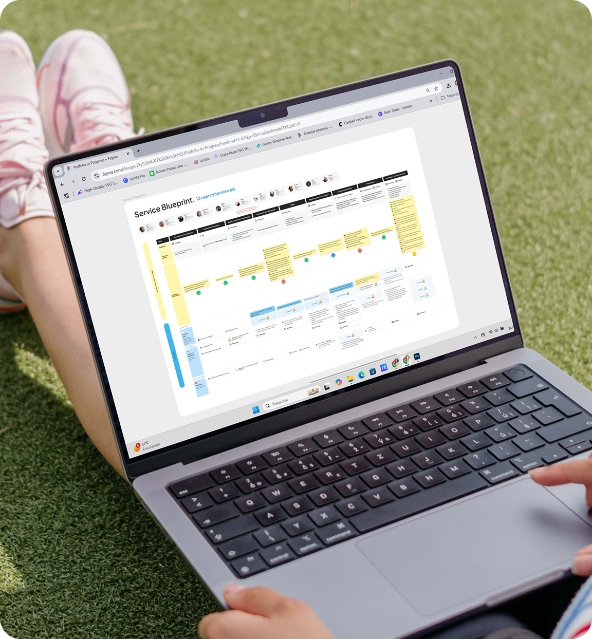
Deliverable 01 - Service Blueprint
The deliverable was the Service Blueprint below.
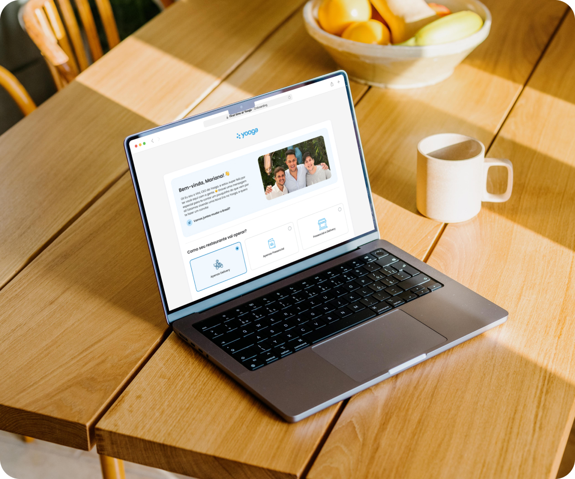
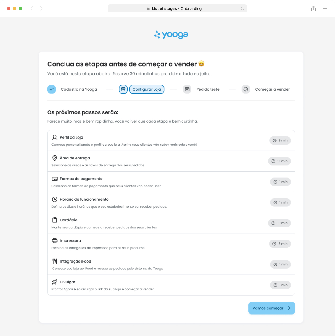
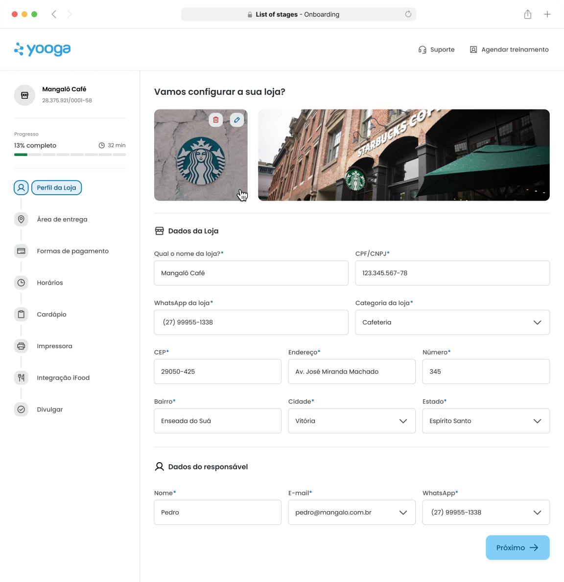
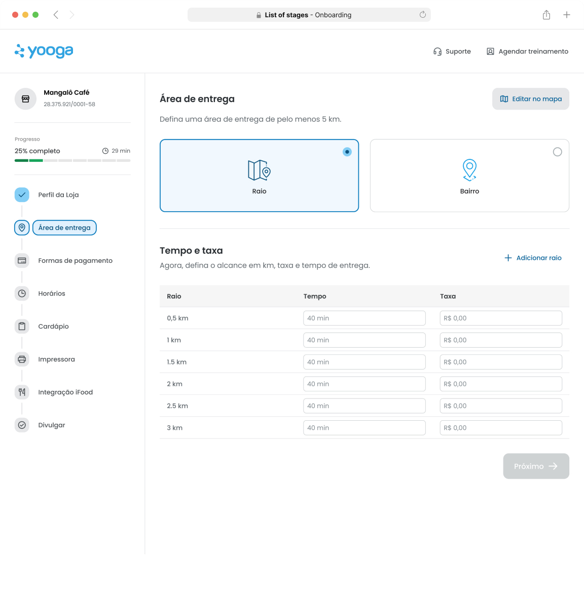
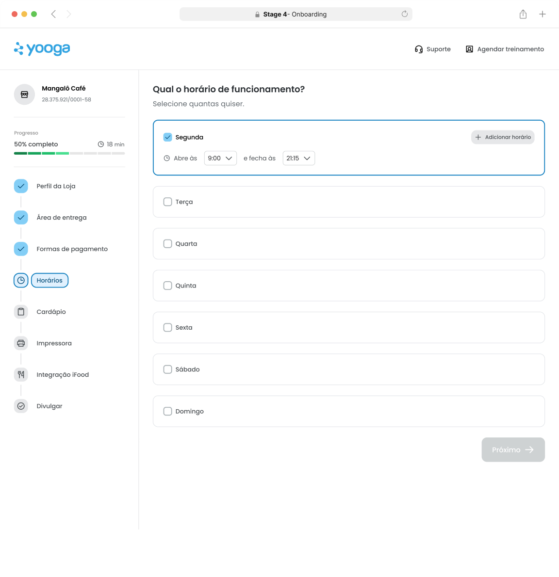
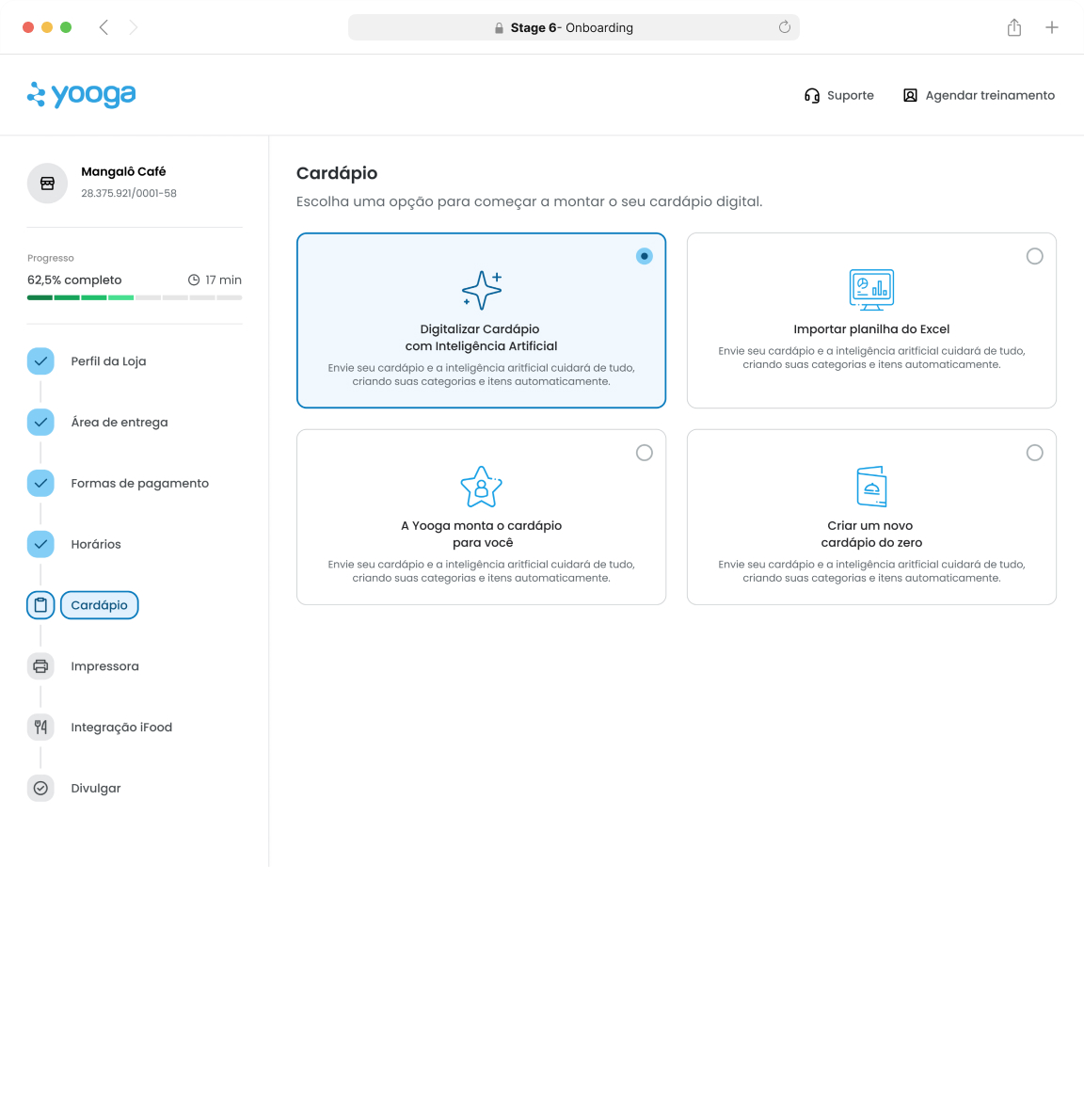
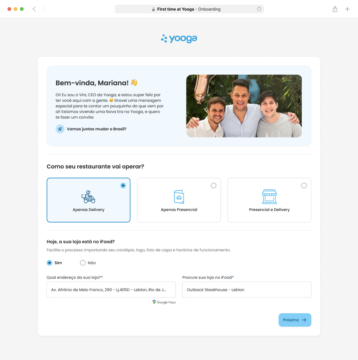
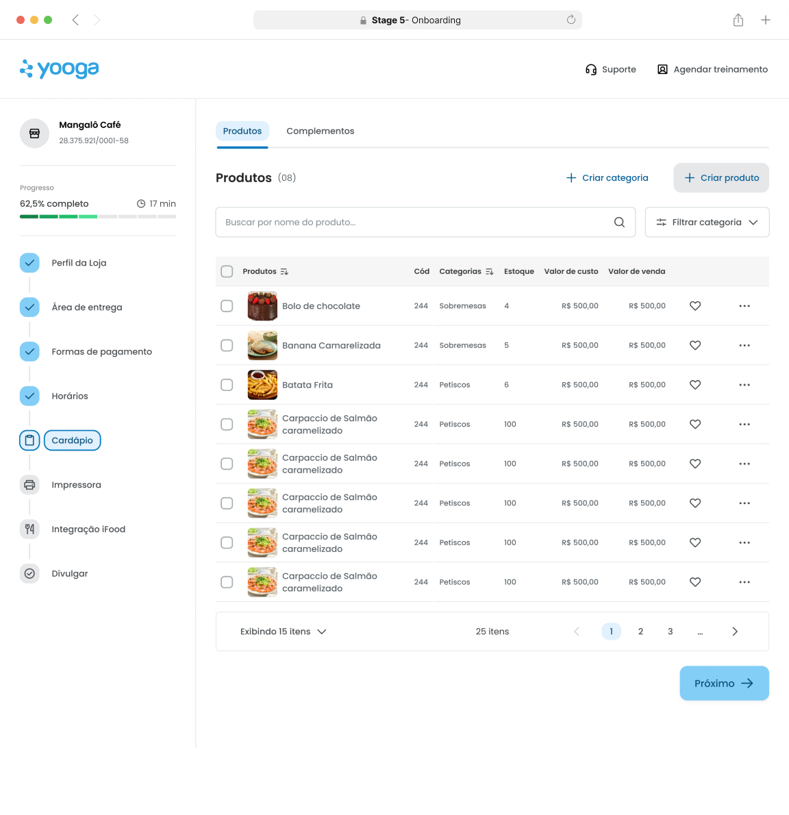
Prototype - Onboarding
I’ve added a few onboarding screens below. There are over 30 in total, covering different flows and variations, but I’ve shared a small sample here to give you a feel for the final design.
Research result: Users reported feeling lost inside the platform,
unsure of where to start.
Gaps: in the demo version and after paying, when the setup
team has been delaying to deliver to respond.
Key Learnings: present
UX Impact:
The service blueprint helped identify pain points in the journey and onboarding process, making it clear there were issues to address.
However, I learned that redesigning the onboarding wouldn’t have a significant business impact, as only around 200 users were signing up each month. After aligning with the team, we agreed it wouldn’t be worth investing five months of development into a feature that would serve such a small audience.
