
Lari Pancieri

Investigating Churn at Yooga
Product Design
UX Research
UI Design
About Yooga Technology
Yooga is a Brazilian foodtech that offers a complete management platform for bars, restaurants, and foodservice businesses. Focused on micro and small entrepreneurs, Yooga simplifies operations like sales, inventory, delivery, finances, and customer service — all in one accessible and easy-to-use system.
In October 2023, Yooga raised $2.3 million in a seed round led by SaaSholic, with participation from Gilgamesh Ventures, Apex Partners, and Backfuture, reaching an estimated valuation of $20 million. At that time, the company already had over 6,000 active clients, was processing more than 4 million orders per month, and surpassing R$2 billion in annual transactions. The business showed strong revenue growth, high gross margins, and was already EBITDA-positive — a rare achievement at the seed stage. Source: Tech Crunch.

Task: After reviewing the quantitative data, I proposed starting with qualitative research, taking responsibility for conducting interviews, documenting user needs and pain points through personas, mapping user journeys, and creating a Service Blueprint to identify gaps. Afterwards,
I would develop a prototype aimed at achieving the desired outcomes.
User Research steps
This stage involved:
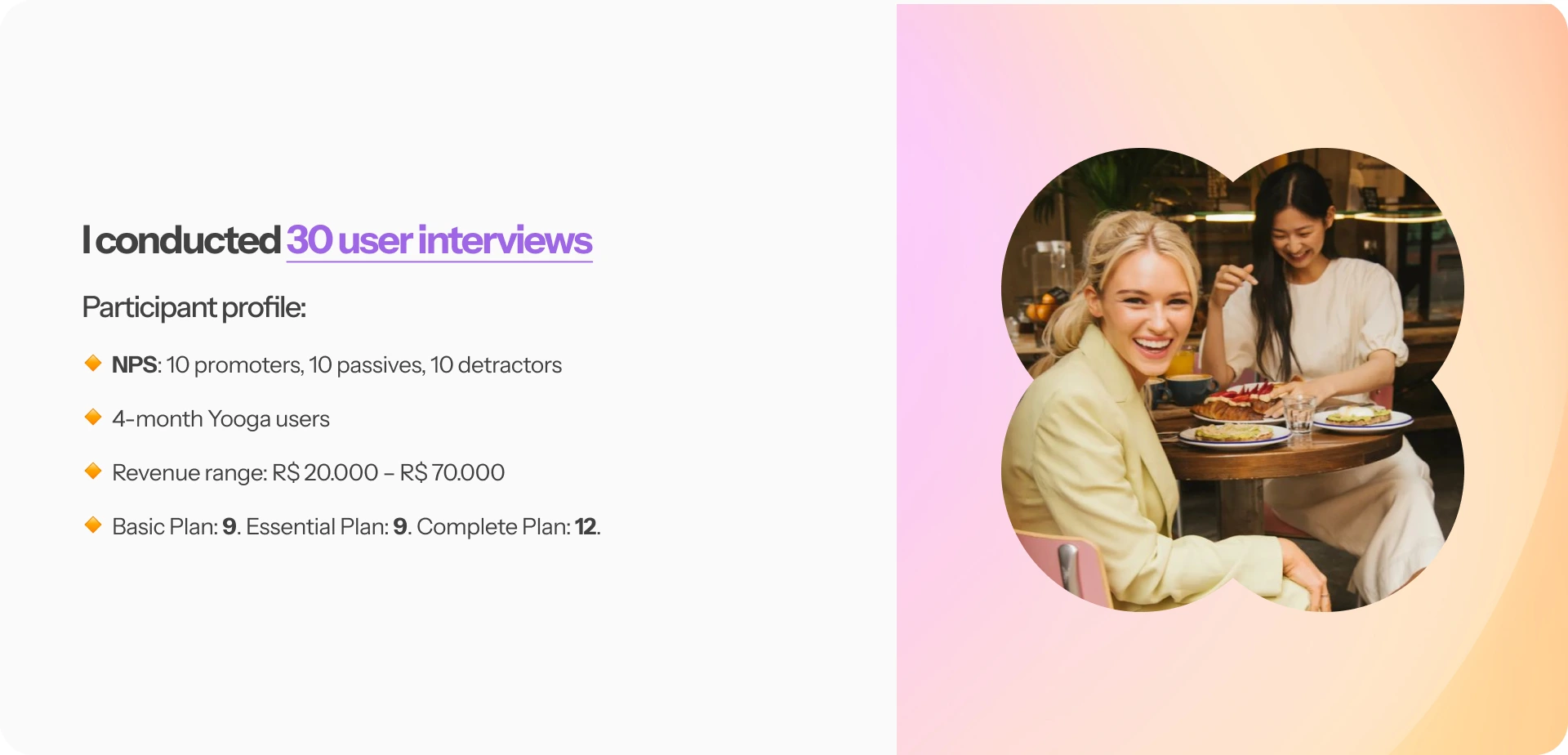
- Defining the research plan with participant profile, interview script and hypothesis.
- PO had recruiting users;
- Interview and analyze data;
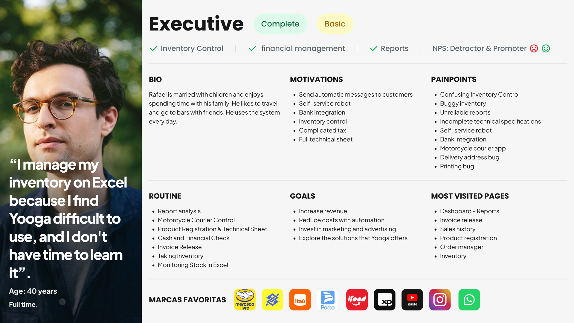
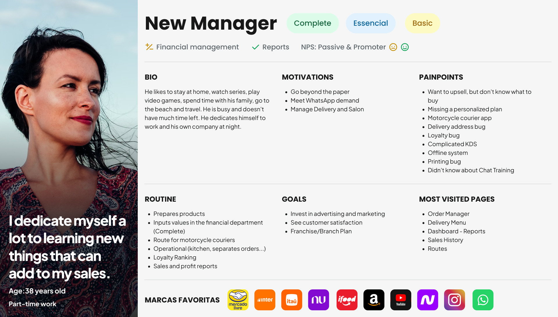
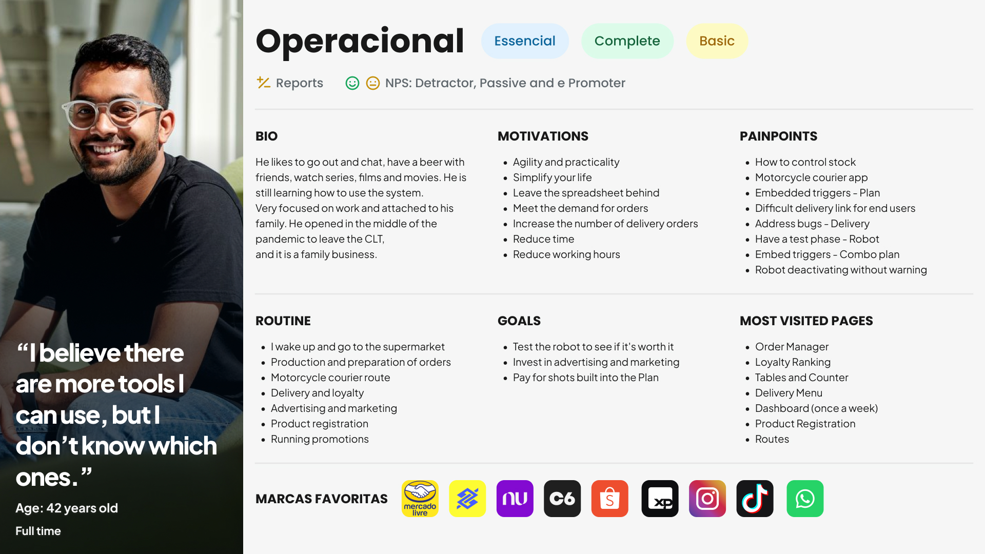
- Synthesizing it into a Persona Document; and presenting the results visually to the team.
Key Learnings: present
UX Impact:
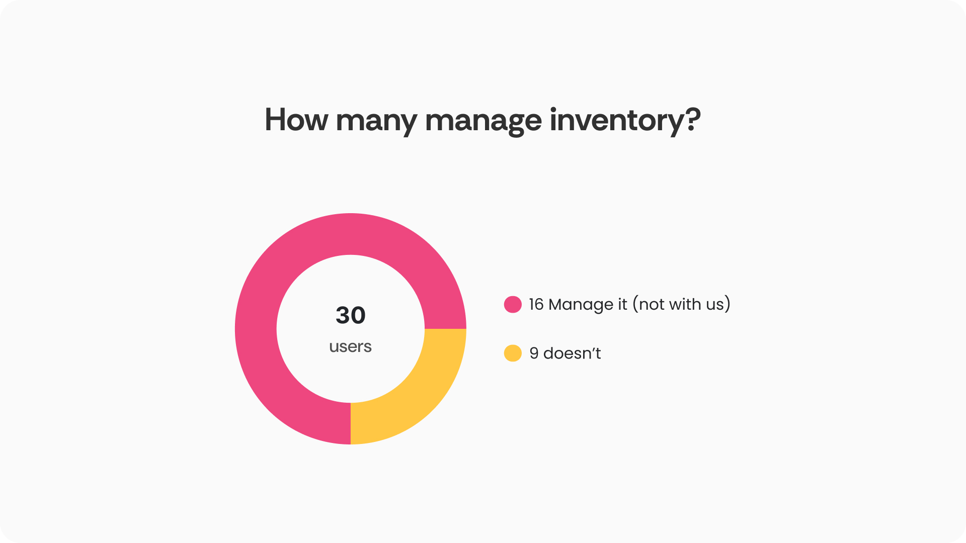
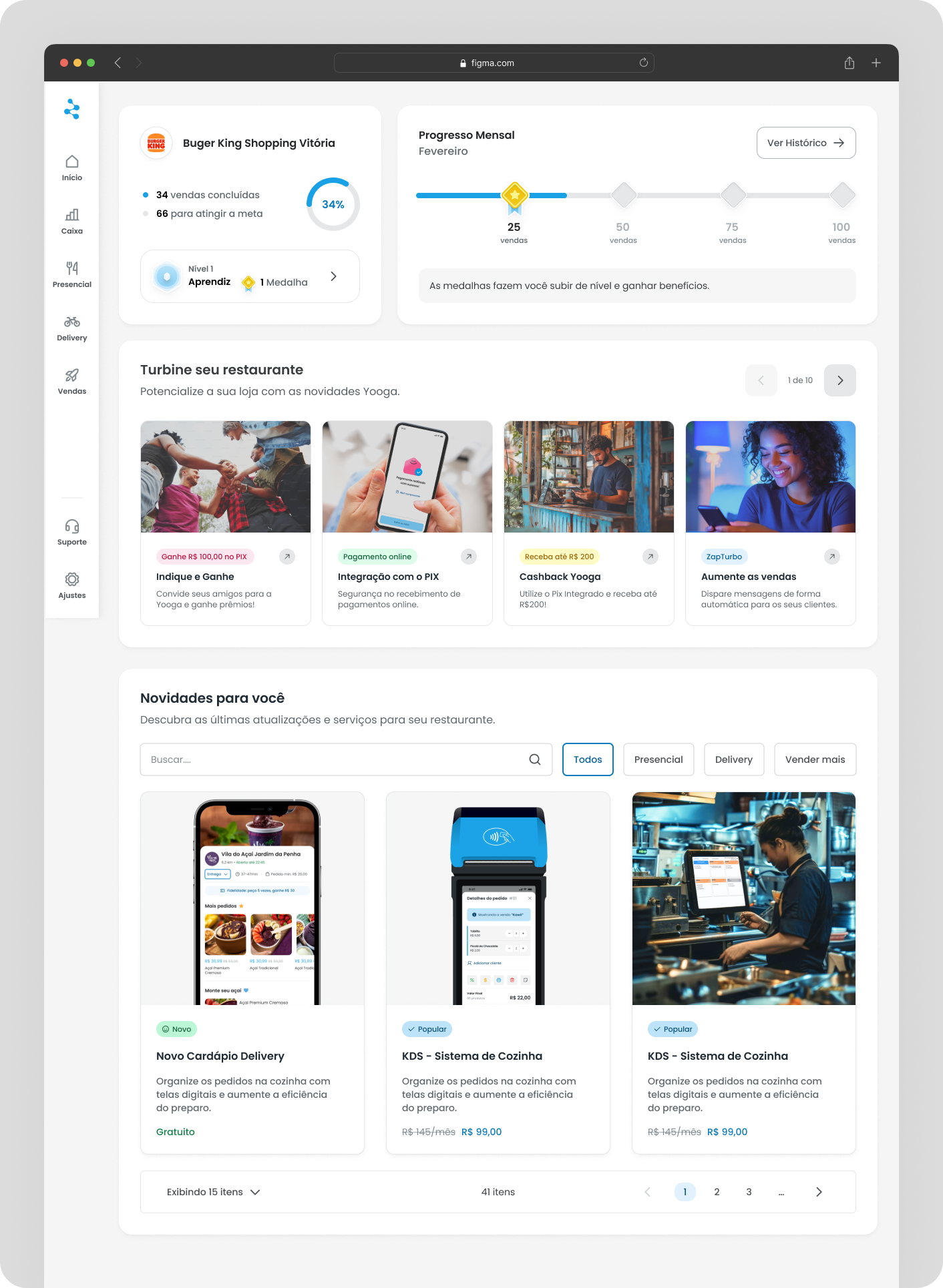
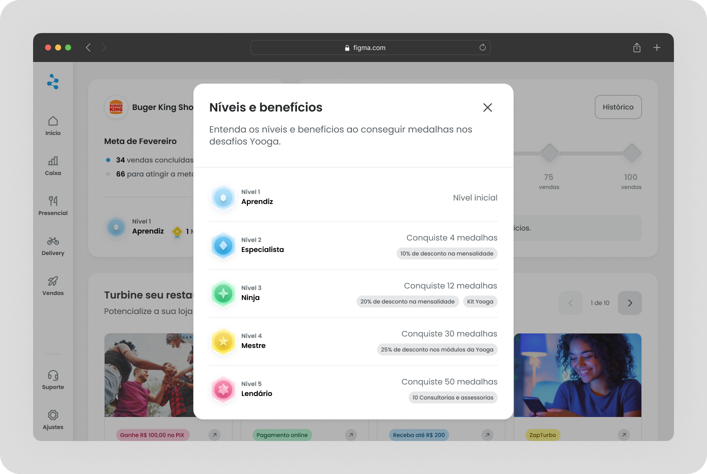
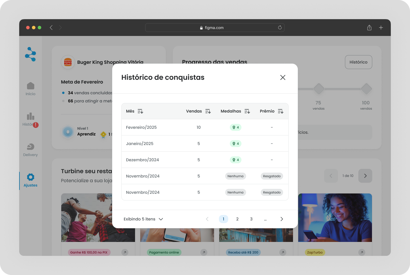
We gathered 6 users — 3 from the Essential plan and 3 from the Complete plan, all of whom had been with us for 4 months. The feedback was positive overall, and the gamification features stood out the most.
Results, Impact, and
Reflections 💡
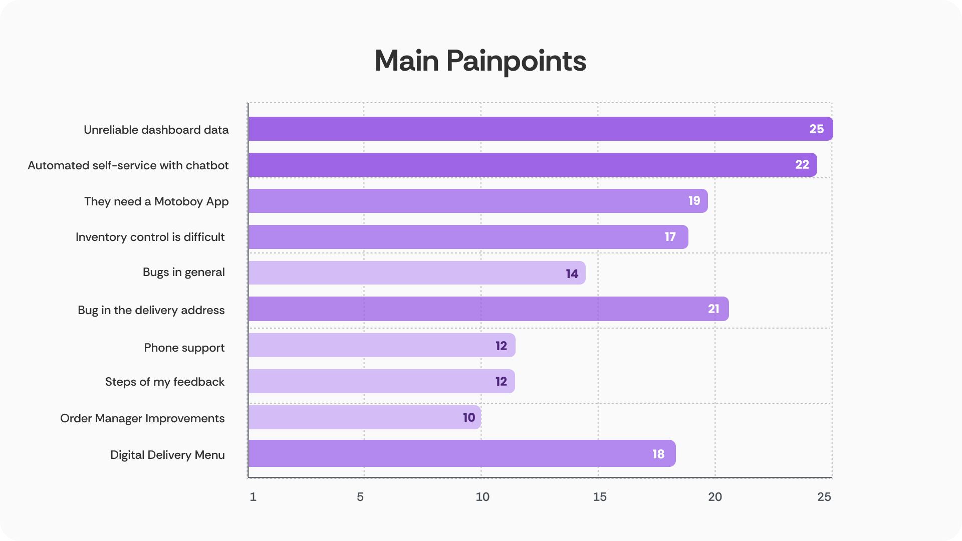
👉 21 users wanted to cancel because they thought Yooga lacked certain features — but the platform already had them.
👉 22 users feel lost during onboarding
Key Learnings: present
UX Impact:
Initially, the team was unfamiliar with the concept of Personas and their value to the company. To ensure research was prioritized, I presented to the product team explaining its purpose and benefits.
Storing research data in repositories like Jira or Dovetail is not enough, as the team often does not access them. A strong UX and Research culture is needed, and a first step can be UX sharing presentations and knowledge bites to engage the rest of the team.
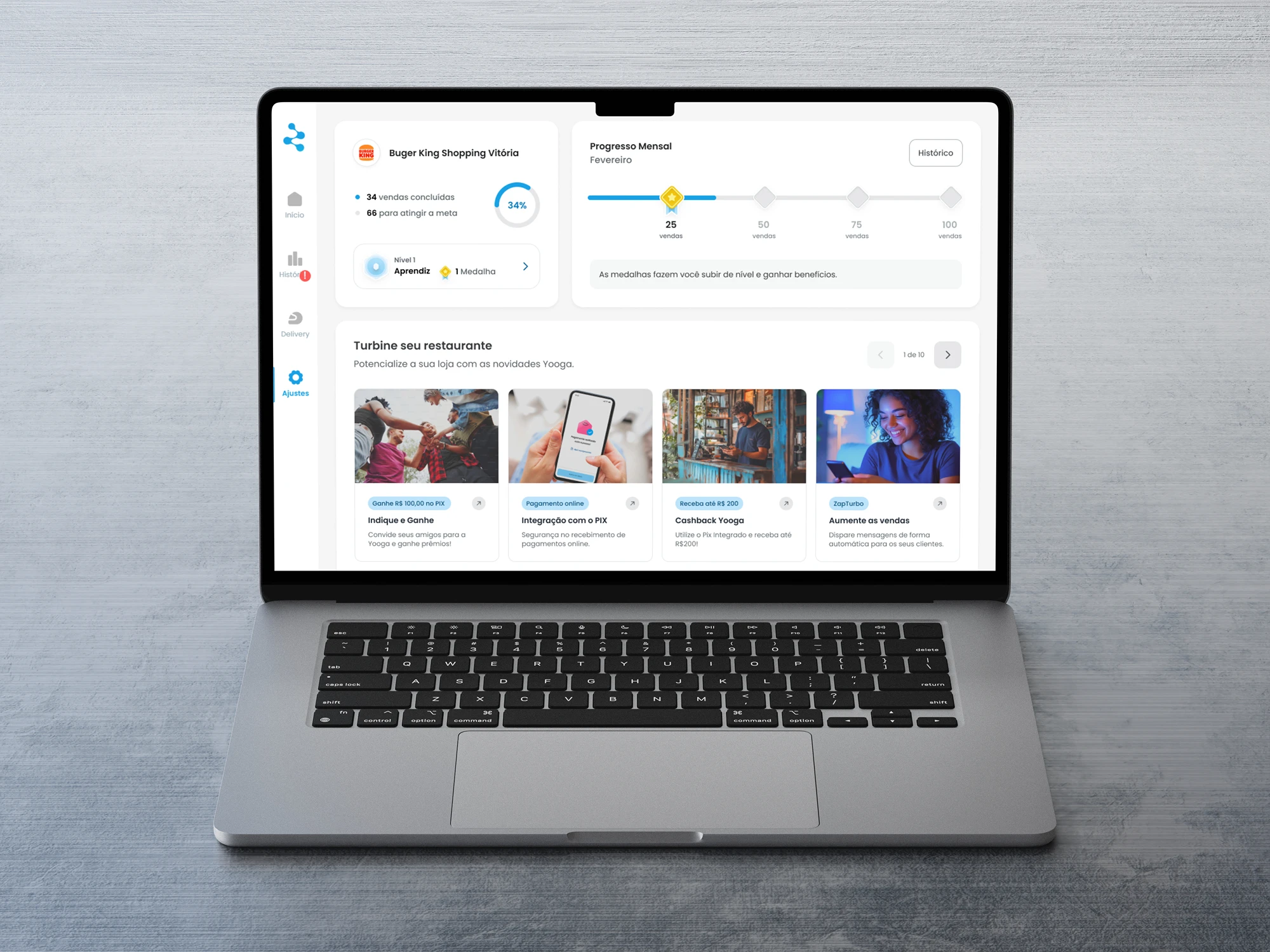
We realized that building a new onboarding from scratch would take around 5 months, while the “What's New” page had a shorter timeline of just 2 months. So we decided to prioritize the release of the “What’s New” page with gamification first.


